Social Setting
Imagine you are stuck in traffic and you notice that the car in front of you doesn't have their headlights on. Being concerned, you want some way of notifying the driver of the car. You honk your horn, blink your headlights, or wave your arms outside your car. Clearly, methods of communication between cars on the road are limited so this does not work and you are unable to warn the other driver about this dangerous situation.
Social Opportunity
In addition to all the safety hazards and issues that go unnoticed by drivers around you, there might be positive things that people may want to say to you while driving, but you can’t ever know what they have to say.
While you are physically close to others while driving, you are completely isolated and closed off in a metal box. Having a clear and efficient way for people to communicate directly can improve safety as well as driver happiness.
With our app, TrafficJam, we plan to break down this communication barrier and create a social experience while driving.

Prototype


When thinking about creating our first prototype we were primarily concerned with the functionality of our app idea and how the traffic scenario would play out. We needed to focus on the communication between different drivers, observe their behaviors, and record their opinions of our prototype after testing. Hence we decided to utilize google sheets and its collaboration function as the initial TrafficJam platform substitute for idea validation and error detection.
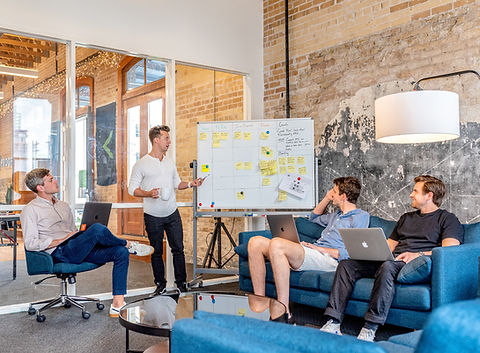
Setting up a traffic scenario in a studio classroom setting, we laid down masking tape to resemble a vehicle lane on a street or freeway. We arranged the lane in a figure 8 pattern so that there would be an intersection with opposing traffic. Utilizing roller chairs as substitutes for cars as well as sticky notes signifying potential hazards (tail lights broken, flat tire, etc.), users acted as drivers communicating solely through our google sheets prototype.
The prototype arranges users by license plate number as a signifying factor. In this case the “license plates” are sticky notes numbered 1-20 placed in front and behind the chairs for a total of 20 users. All 20 users have the ability to notify a particular user of a potential hazard and that particular user has the ability to respond to the notification.
After explaining the instructions to the 20 users, we let the scenario play out with users ‘driving’ around in the figure 8 pattern for about 5 - 6 min. (User testing video below). At the conclusion of the scenario we sent out a survey asking questions on the overall experience of the scenario, using the prototype, and suggestions for improvement.
User Testing
User Feedback
Observing the users act out our traffic scenario there were a couple points of interest regarding the use of our initial prototype. We began to notice the amount of concentration it took for the users to both input notifications and responses while rolling in their chairs. They not only had to maintain a constant flow of traffic, but also pay attention to potential ‘hazards’, as well as keep track of their notifications and responses to/from other users. This prototype translating to a real life traffic scenario would cause people driving increased stresses associated with driving as a result of the increased cognitive load and may overall be a distraction to driving, potentially leading to accidents.

Too much information
Crowded
Distraction
Overwhelming
No Customizability
Confusing colors
The results from the survey confirmed the observations we had witnessed during the scenario. Many of the problems mentioned had to do with the fact that the prototype was distracting to use while also rolling in the chairs. In addition, they mentioned that the prototype itself was overwhelming as you can see every users’ notifications and responses. Too much information, confusing colors, crowded nature of the prototype, and no customizability were also other concerns that users had while using the prototype.
When asking for improvements to our prototype some notable mentions include implementing colors that had visual meaning (Red for alert, yellow for hazard, etc.), safety features that would make it less distracting to use the prototype while driving, and an overall less crowded and confusing user interface.

Low Fidelity Mockups


Taking the feedback received from our first prototype, we began incorporating it to create a second prototype. First, we created wireframes in Figma to establish the flow of our app. What screen lead to mass alerts, how would the user transition from the map to notifying cars, etc. Our goal here was to figure out how to make our app flow seamlessly and intuitively as possible without overwhelming the user with information like the first prototype did for some users.
Having the overall structure of our app mapped out, we then created a low-fidelity prototype. The purpose of this version was to try out solutions to the problems found in the first prototype as well as transition into more of a phone-like interface. A map of the road was now included with color coded car images for easy recognition of the different cars around the user. Instead of the user having view of every single message, they now only have access to messages directed to them, lowering the amount of information the user has to look at. Like our first prototype, there is also a list of pre-written notifications and responses for the user to select and send to the car of their choice.
High Fidelity Mockups


Our design was finally starting to look like an app. But we reviewed our second prototype again and wondered how we could even further improve our design as well as address all the concerns we received and concerns that we might receive by potential future users. This led to us making the choices that we did when creating our third, high-fidelity prototype.
Instead of looking at multiple pictures representing the screens of our app, you can now smoothly transition from screen to screen. For the issue of keeping drivers safe while using TrafficJam, we decided that implementing a voice recognition feature would be the best solution. Our prototype does not actually incorporate voice recognition at this time, being our first high-fidelity prototype, but it is a huge factor in making our app driver-friendly. This prototype also has a route feature as its homepage as well as incorporates a Mass Alert function to send to all the other cars around the user for various messages (traffic ahead, etc). We decided to add a place where the user can view all the messages they have received by other users rather than just having only a pop-up appear briefly on the screen. The user can look at their messages later when they are not driving.
Taking from the previous prototype, the user can still send custom messages on top of the pre-existing ones, but now they can call other drivers and have verbal conversations with them. We also decided to make the default messages appear as simple icons, something that was initially done in our wireframing. Our reasoning for bringing this feature back is because the driver has enough on their plate while they are driving and potentially trying to communicate with other drivers; we didn’t want to give them more text than necessary for them to read and go through.
Prototypes & Traffic Interaction


This experience taught us a lot about not only the process of prototyping and design, but about our desired social setting itself. There are a lot of factors that went into creating TrafficJam that would have never occurred to us had we not gone through this process. For example, we were unsure that people would even respond well to our idea of communicating while driving.
After testing our first prototype, we discovered that we were wrong; a lot of people responded positively to our idea and implementation and wanted to communicate to drivers. We also then learned what people wanted to communicate. We received many suggestions, a lot which had not crossed our minds. Throughout our brainstorming process, we had been focused on warning other drivers about issues having to do with safety on the road, but we discovered that people also wanted to have friendly talks and compliment other drivers on their cars or cute pets in their cars. Driving can have a negative aspect to it, especially if they live in a high-traffic area, and it was interesting to see that people wanted to be positive and enjoy their time driving by communicating with other people.
However, trying to achieve communicating car-to-car through technology has a lot more complications than one would think at first. There is the law and safety to consider, which was why we were really focused on fixing the complaints that there was too much going on in our prototype. Obviously, we do not want to cause anyone to have an accident on the road, so it is vital to figure out a way to balance using technology while driving with maintaining road safety.
Team/Contributions


Bruke Tamrat
User Testing, Design and Layout for online portfolio. Content for online portfolio (Social Setting, Prototype, User Feedback)
Mark Quinby
Rachel Duncan
Anthony Morrell
Design and workflow for High fidelity prototype (3rd Prototype)
Lo-fidelity Wireframes, Content for online portfolio (Social Opportunity, Lo/Hi fidelity, Prototypes & Traffic Interaction)
Design and workflow for High fidelity prototype (3rd Prototype)
Bao Huynh
Low to Mid fidelity prototype (2nd Prototype)
Everyone contributed to the pitch, slides, research report, 1st prototype, and evaluations (survey & observations)